keman-ai/dsh-skin-pack--packages-dsh-cosmic-exploration ↗★ 5
dsh-cosmic-exploration
黑神话悟空·火焰山——一款用于 DeepSeek Harness 的暗色皮肤:黑墨、古铜金与余烬橙,新会话页面带有全屏火焰山视觉效果。
AI 分析
核心用途是为 DSH 提供黑神话悟空主题的暗色皮肤。适合喜爱国风、黑金与余烬橙配色及火焰山视觉元素的黑神话玩家。
安装
npx -p @deepseek-ai/dsh dsh plugin --profile web add github:keman-ai/dsh-skin-pack#83e92004f8c3b52b9bf66d75aa96ddbc709bde13&path:packages/dsh-cosmic-exploration说明文档
阅读完整 README ↗dsh-cosmic-exploration · Cosmic Exploration
A skin for DeepSeek Harness (dsh): a deep blue space ground with cool blue and nebula violet, and a full cosmic-exploration cover on the new-session page.
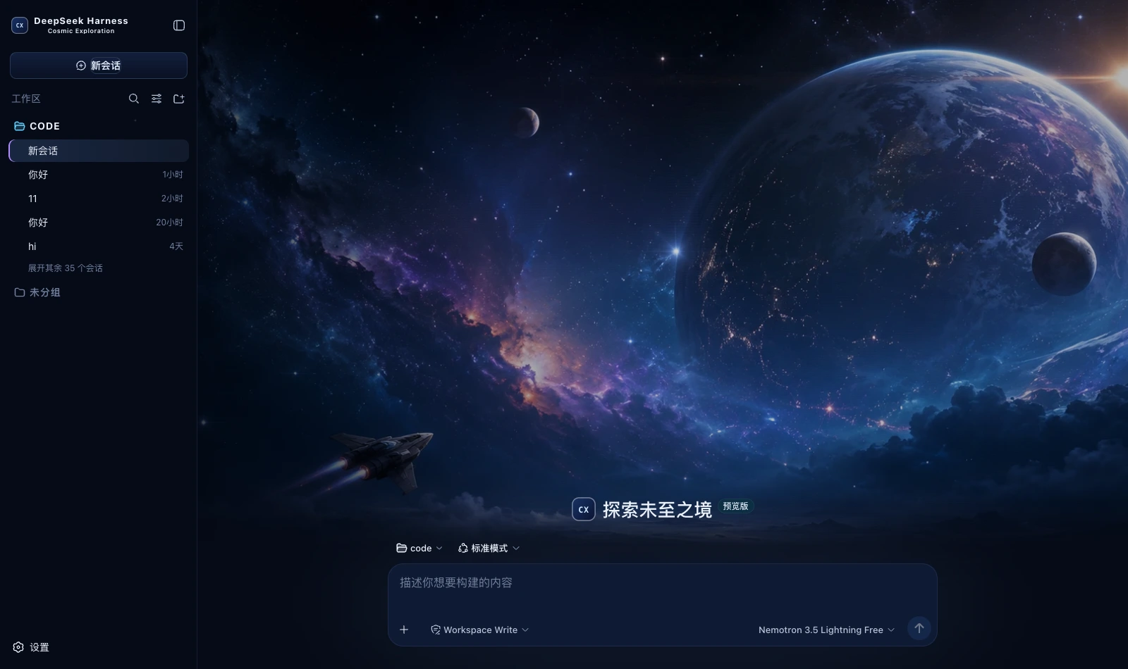
What it changes
| Surface | Content |
|---|---|
| Palette | A deep blue space ground (#050814) with three blue-black panel levels; borders split two ways — cool blue for broad layering and nebula violet for emphasis |
| Global | A 14% starfield layer (the four scattered points from the prototype's body:before). Without it the interface is just a field of deep blue |
| New session | A full-screen cover: two nebula glows, scrims left and right and a darkening from the bottom up, with the composer pinned to the bottom over the image |
| Brand slots | The sidebar and new-session marks become a mission badge (a deep blue gradient square, a cool blue border and the monospace code CX), subtitled Cosmic Exploration |
| Persona copy | Thinking → Charting the unknown…; failure → Navigation anomaly detected. |
| Status dock | Always present on the chat page: a reduced cover plus six kinds of real state, collapsible (the choice is remembered) |
🔴 The warm tone is for states, never buttons
The Theme rules in the prototype's Appearance panel are explicit: deep blue space as the main ground, cool blue and violet nebula as the visual climax, and a small amount of warm colour for important states and the mission button only. New Mission uses the full-screen cosmic-exploration cover, while Console / Trajectory return to a low-distraction, genuinely usable Harness product interface.
In implementation:
- the primary action is solid nebula violet (the hero's
START EXPLORATION →is a violet gradient in the prototype), while New session is a deep blue gradient with a cool blue border — once an accent spreads, it stops meaning "the one that matters most"; - the warm tones (#ffb772 / #f0b46d) are reserved for states that need your attention and never appear on an ordinary button;
- running uses the Glow cool blue
#61d0ff: the brightest thing in all this deep blue, without competing with the violet primary action; - the cover is drawn on the hero only, with none of it on the chat or trajectory pages — the prototype requires those two to stay low-distraction and genuinely usable.
What the status dock shows
| Card | Fields | Source |
|---|---|---|
| Waiting on you | Tools awaiting approval, questions awaiting an answer | ConversationSnapshot.pending. Appears only when something is genuinely waiting |
| Current Session | State, elapsed turn time, current tool duration, inbox, model | running / turnTimings / runningCalls / queue; the model comes from the latest assistant message's provenance.model |
| Context | Occupancy %, token load, and the System / tool-schema / conversation composition bar | The contextPressure and contextBreakdown projections |
| Permission | The active permission and sandbox mode | The permissions projection |
| Usage | Input / output / cache hits / time spent / turns | The tokenUsage and sessionStats projections |
| Plan | Todo progress | The todos projection (the card is absent when there is no list) |
| SHIP SYSTEMS | Tool name · real duration · outcome | Trajectory tool-result nodes (duration = time - callTime) plus the snapshot's runningCalls. Appears only once a call has happened |
| CONTEXT FEED | The source and form of each context injection | Trajectory context nodes (provenance.label / form) |
| COMPACTED | Compaction count, items and tokens folded | Trajectory compaction nodes. Absent when nothing was compacted |
⚠️ A tool duration may be absent: it can only be computed while the matching tool/call is still inside the session window. Older calls that scrolled past report only name and outcome — better blank than an invented figure.
⚠️ Composition is not a total: the three contextBreakdown figures use fixed-density estimates (systematically low for Chinese and JSON schema)
and do not add up to the token load, which is anchored to the provider's reported value. The UI says so too.
Deliberately not done
Of the four cards in the prototype's right column only Current Mission maps to real data; the rest are hardcoded decoration
with no matching projection in the harness, and none are built — decoration is fine; fake state is not:
- the five
ONLINE/SYNCED/STANDBYrows under Ship Systems - the Signal 97.2% and Route score 82 under Telemetry
- the static shortcut cheat sheet under Shortcuts
- the four mission parameters at the left of the hero (Mission / Sector / Signal Strength / Jump Window)
Of the six agent-copy lines only the two with an anchor are built: Tool / Context / Success have no intermediate state to attach to in the harness
(a tool row has only ok and error, with no running), and nothing is forced.
Install
Skin market (recommended): find it in the market and install, then restart dsh.
Manual install (during development):
npm install && npm run build
DST=~/.dsh/profiles/web/node_modules/dsh-cosmic-exploration
mkdir -p "$DST" && cp -R lib cordis.patch.yml skin.json package.json README.md "$DST/"
# then add dsh-cosmic-exploration to the profile package.json's dependencies and dsh.profile.bundles
After changing it you must restart dsh: the profile tree has to be recomposed, and without a restart the UI stays as it was.
🔴 The side effect of autoApply
Installing switches to this skin by default (autoApply, default true). The reason is that the harness does not persist third-party theme ids,
and the built-in Settings → Appearance has only three cells: light / dark / follow system, with no third-party themes —
switching manually requires the skin market's own panel (Settings → Skin Market).
The cost: it reapplies on every refresh, so switching away lasts only for that session. To change permanently, set autoApply to false
or uninstall the plugin. It is implemented as an 8-second window after startup (long enough to outlast the Host preference snapshot), after which it lets go entirely.
Version requirements
Requires dsh 0.1.1-rc.2 or newer. The brand-slot takeover relies on slot priority shadowing (only equal
priorities count as a conflict; different priorities shadow, and the lower number renders). On older versions these three registrations throw and are swallowed,
merely falling back to the official brand mark, while the palette and cover keep working.
Assets
The cover is a 1672×941 illustration compressed to webp (q92, 222 KB) and inlined into the bundle rather than linked from an image host — it has to work offline and on an intranet. How it is generated and its resolution ceiling are documented at the top of src/client/cover.generated.ts.
Development
npm run check   # tsc --noEmit
npm run build   # produces lib/index.js (host half) and lib/client.js (browser half)
lib/ must be committed: skins install via github:owner/repo, which installs the build output from the repository;
if the source moves and the output does not, people install the old version (and the market uninstalls the package outright over the missing entry file).
License
MIT © Science Roam Limited