keman-ai/dsh-skin-pack--packages-dsh-forest-companion ↗★ 5
dsh-forest-companion
Forest Companion — a dark skin for DeepSeek Harness: deep forest green, soft cream and a touch of pink, with a full-bleed forest companion cover on the new-session page
安装
npx -p @deepseek-ai/dsh dsh plugin --profile web add github:keman-ai/dsh-skin-pack#83e92004f8c3b52b9bf66d75aa96ddbc709bde13&path:packages/dsh-forest-companion说明文档
阅读完整 README ↗dsh-forest-companion · Forest Companion
A dark skin for DeepSeek Harness (dsh): deep forest green, soft cream and a touch of pink, with a full-bleed forest companion cover on the new-session page.
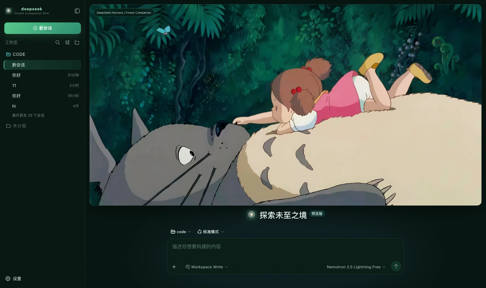
What it changes
| Surface | Content |
|---|---|
| Palette | A full set of --dsw-alias-* / --dsw-specific-* semantic tokens on the dark base, with every border a 1px line tinted grass green |
| New session | The cover takes all the height above the composer (a 16px radius, a grass-green border, a deep shadow), the composer sits separately below, and an identity badge occupies the top-left corner |
| Brand slots | The sidebar and new-session marks are a pure-CSS shaft of forest light (a cream core, a grey-green ring, a deep-forest ground and a green glow), with the subtitle Forest Companion Skin |
| Status dock | Always present on the chat page: a reduced cover plus six kinds of real state, collapsible (the choice is remembered) |
The palette is the prototype's own three words
The prototype's notes read "deep forest green, soft cream and a touch of pink echoing the character", and the
handoff says theme = deep green / soft cream / warm pink. Three words, three uses:
- Deep forest green: ground, panels, borders and the primary action — most of the interface;
- Soft cream
#e9e0c5: only at the end of the energy bar and in the brand mark's core, like light through the canopy; - A touch of pink
#d96f95: the prototype uses it in two places only, both very faint — a 5% glow on the cover and the current-mode card's border. "A touch" is its definition; spread wider it no longer echoes the figure in the picture. Here it lands on the cover glow (copying that 5%) and on hovering a destructive action, and the error colour leans pink too (#e07f9f) — the prototype gives no error colour, and pink is its only warm-against-cool contrast, which keeps nothing glaring while introducing no fifth colour out of thin air.
Running uses teal #4db9b0, a step apart from the success green — running and success should never read as one.
The layout follows the prototype
The prototype states the rule itself: New Session keeps the whole cover with the composer separately below,
while the left and right columns keep Harness's full session, system, mode and status information. Its #home is
likewise column plus .hero { flex: 1 } with a separate .composer below. So the cover does not sit over the composer, and carries no copy beyond the badge in its top-left corner.
What the status dock shows
| Card | Fields | Source |
|---|---|---|
| Waiting on you | Tools awaiting approval, questions awaiting an answer | ConversationSnapshot.pending. Appears only when something is genuinely waiting |
| Current Session | State, elapsed turn time, current tool duration, inbox, model | running / turnTimings / runningCalls / queue; the model comes from the latest assistant message's provenance.model |
| Context | Occupancy %, token load, and the System / tool-schema / conversation composition bar | The contextPressure and contextBreakdown projections |
| Permission | The active permission and sandbox mode | The permissions projection |
| Usage | Input / output / cache hits / time spent / turns | The tokenUsage and sessionStats projections |
| Plan | Todo progress | The todos projection (the card is absent when there is no list) |
| Forest tracks | Tool name · real duration · outcome | Trajectory tool-result nodes (duration = time - callTime) plus the snapshot's runningCalls. Appears only once a call has happened |
| Context injections | The source and form of each injection | Trajectory context nodes (provenance.label / form) |
| Folded away | Compaction count, items and tokens folded | Trajectory compaction nodes. Absent when nothing was compacted |
⚠️ A tool duration may be absent: it can only be computed while the matching tool/call is still inside the session window. Older calls that scrolled past report only name and outcome — better blank than an invented figure.
⚠️ Composition is not a total: the three contextBreakdown figures are fixed-density estimates and do not add up to the token load.
Four things deliberately not done
These are all hardcoded decoration in the prototype with no matching projection in the harness, so none are built — decoration is fine; fake state is not:
- the five
ONLINErows under Harness Systems in the right column - the four Companion Modes cards in the right column
- the 83% and 100% under Forest Energy in the right column
- the "☘ GROVE ONLINE" badge in the cover's top-right corner
No host copy is replaced either: this prototype gives no agent-copy specification, and inventing lines without a basis is embellishment.
Install
Skin market (recommended): search for "Forest", install, then restart dsh.
Manual install (during development):
npm install && npm run build
DST=~/.dsh/profiles/web/node_modules/dsh-forest-companion
mkdir -p "$DST" && cp -R lib cordis.patch.yml skin.json package.json README.md "$DST/"
# then add dsh-forest-companion to the profile package.json's dependencies and dsh.profile.bundles
🔴 The side effect of autoApply
Installing switches to this skin by default. The harness does not persist third-party theme ids, and the built-in Settings → Appearance offers only
three cells — light / dark / follow system — so switching manually requires the skin market's own panel. The cost is that it reapplies on every refresh:
switching away lasts only for that session. To change permanently, set autoApply to false or uninstall.
Version requirements
Requires dsh 0.1.1-rc.2 or newer (the brand-slot takeover relies on slot priority shadowing; older versions simply fall back to
the official brand mark, with the palette and banner working as usual).
Assets
The cover is a 2048×1110 illustration compressed to webp (q92, 140 KB) and inlined into the bundle rather than linked from an image host.
How it is generated and its resolution ceiling are documented at the top of src/client/cover.generated.ts.
Development
npm run check   # tsc --noEmit
npm run build   # produces lib/index.js (host half) and lib/client.js (browser half)
lib/ must be committed: skins install via github:owner/repo, which installs the build output from the repository.
License
MIT © Science Roam Limited